Step 1: Read both of the assigned, online articles about low-fidelity prototyping:
- Chen, A. (2009). Why low-fidelity prototyping kicks butt for customer-driven design.
- Busche, L. (2014). The skeptic’s guide to low-fidelity prototyping. Smashing Magazine, October 6, 2014.
Step 2: Create a landing page for a website in two versions: a good example of a low-fidelity prototype and a poor example of a low-fidelity prototype. Hint: You are not creating a good and bad web design. The design of your webpage should be good in both cases, but one version will demonstrate a good low-fidelity representation and the other will show us a bad low-fidelity representation.
- You may use whatever tools make sense for you. Feel free to sketch and snap a picture with your Smartphone.
- You can use your design as an example, but feel free to create a fake website or draw inspiration from an existing site.
Step 3. Post your pictures in this discussion, and explain what makes your good example good and what makes your bad example bad. Focus on the essential characteristics of a low-fidelity prototype. Hint: You first will need to upload each image to "My Files." Then, you will click the "Canvas" tab and navigate to your uploaded image to add it to the discussion.
- Be sure you clearly identify which image is the good vs. bad example.
- Use information from the online articles to support your explanation.
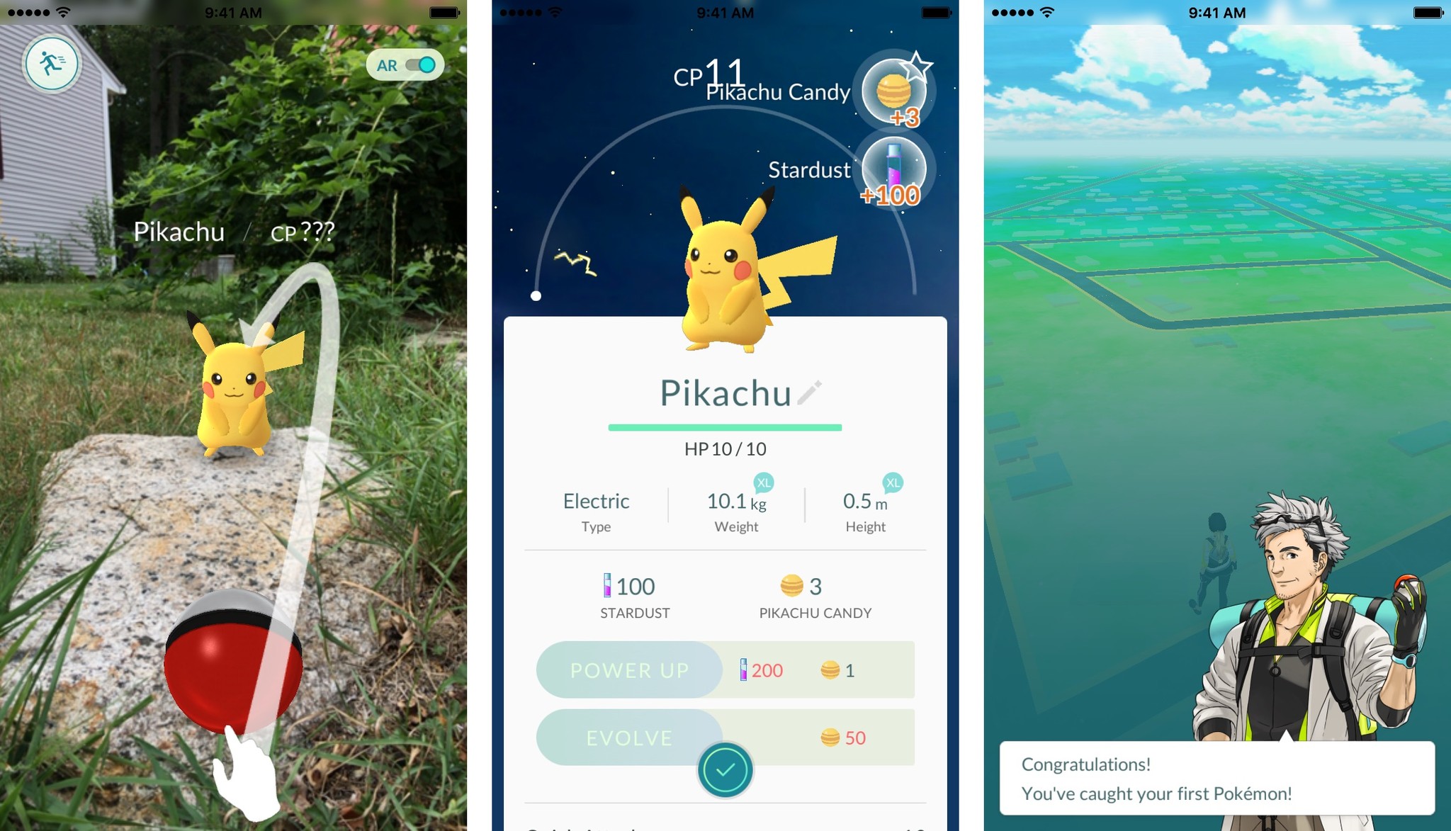
So, my initial "low-fidelity" prototype was sort of weak & just a copy of online screenshots I found along with my accompanying notes.
Initial:
This is a "bad" prototype because everything is all laid out and leaves little to the imagination.
When I made a greater effort, and having read the "kick-butt" material with cool suggestions, I came up with the following:
The NHMU image that I used as the reality to be augmented: https://architizer-prod.imgix.net/mediadata/projects/492011/e89041ca.jpg?q=60&w=1080
This is a "good" prototype, because while it clearly draws from my initial Pokemon Go inspiration, it leaves much to the imagination and is even a bit interactive - a client can walk through prompts/response options (folded blue and pink stickies, respectively) and see how a user might progress through the landing page of the AR app.
No comments:
Post a Comment